Notification Stream
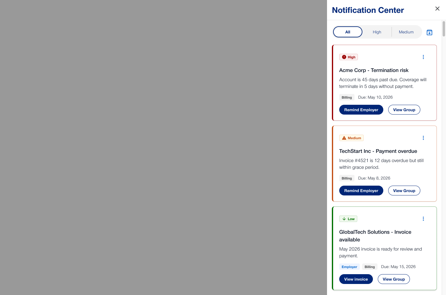
A personalized notification stream surfacing urgent action items and market updates.
*Some content has been redacted due to PII and confidentiality.
01 — Context
Context
- Role
- Design Team Lead
- Timeline
- ~8 months
- Tools
- Figma, FigJam, Dscout
- Team
- 3 designers, 5 engineers, 1 PM
02 — Discovery
Discovery
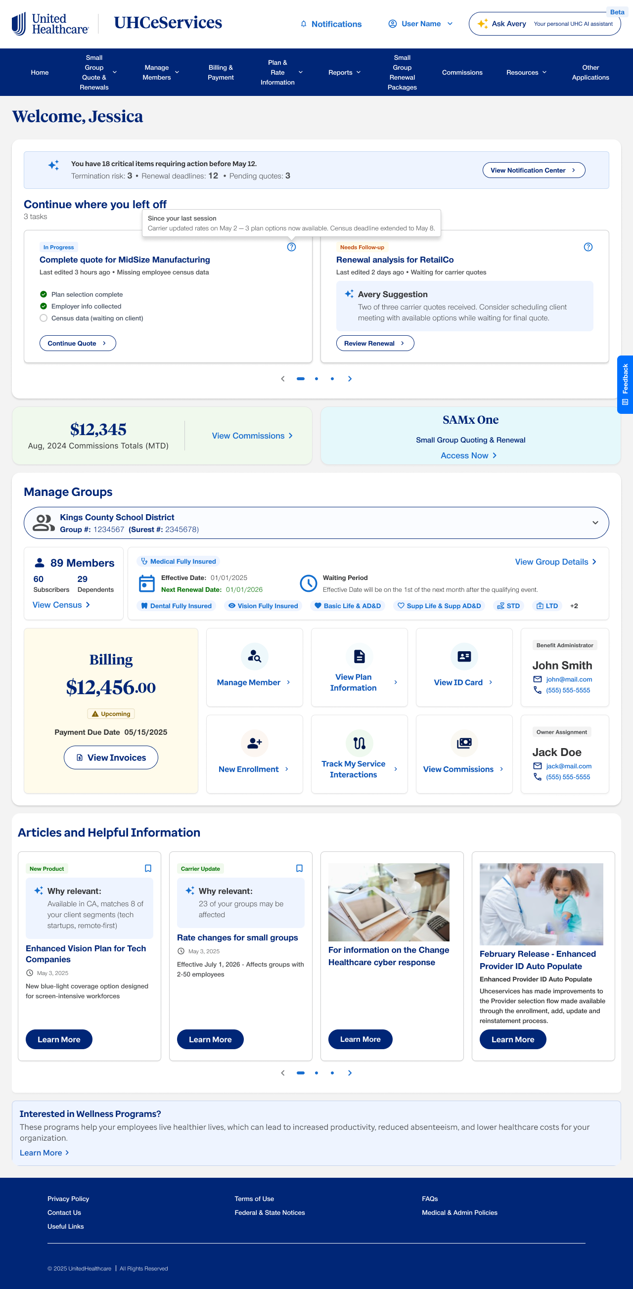
Users were hopping between separate platforms just to figure out what to do next. The funnel data made it visible: people bounced between surfaces and routinely missed time-sensitive items in one because their attention was stuck in another.
I ran 10 interviews across roles and seniority, then shadowed 4 people through their first-thing-in-the-morning ritual. One sentence came up almost verbatim every time: "I never know which screen to start on." That was the whole problem, said plainly.
03 — Problem & Alignment
Problem & Alignment
The product had split "urgency" across multiple channels, so the actions you owed and the information you needed were scattered. Users were doing the merge in their heads, first thing in the morning, badly.
With product and engineering, we committed to a single stream: every notifiable event flows through one ranked surface, weighted by urgency, recency, and relevance to whatever you're actively working on.
The non-negotiable everyone signed up for: the stream had to feel calm. Dense and stressful would have just recreated the problem in one place instead of five.
04 — Strategy & Product Plan
Strategy & Product Plan
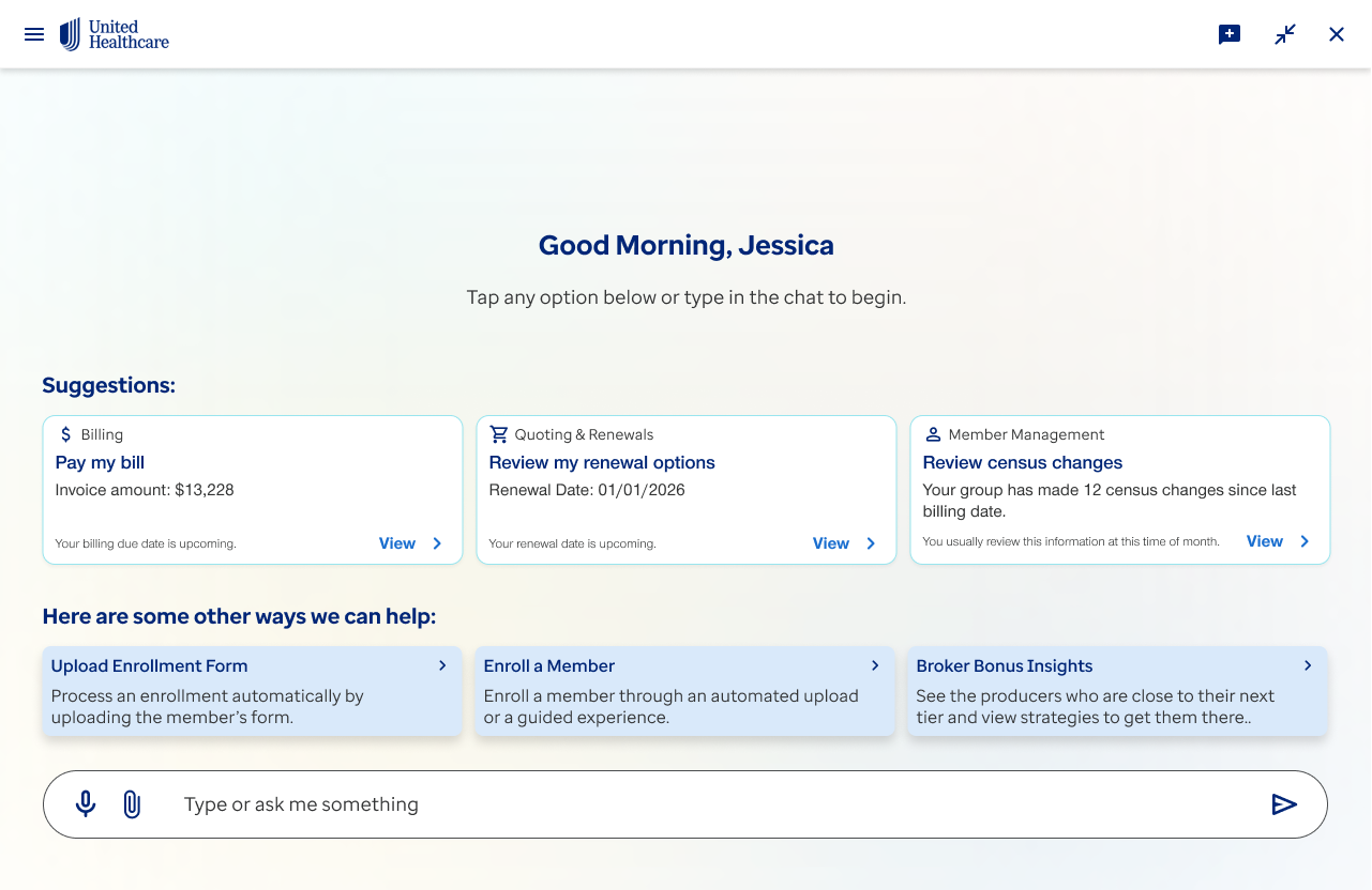
The bet: one stream where the next right action is always sitting above the fold, so the morning starts with a decision already made for you.
What "good" meant:people should reach their first urgent item in a swipe or two, and the stream should feel like it's working for them — measured through moderated tasks and a CSAT read after launch, not a single vanity number.
The design work: a ranked, card-based stream with three archetypes — urgent action, FYI market update, informational system message — each given a deliberately different visual weight; per-user controls to snooze, mute, or pin categories; and an empty state actually worth landing on.
How we de-risked it: three rounds of moderated prototype tests, weekly requirement check-ins with product and business, and a two-week guardrail dashboard before broad rollout.
05 — Takeaways & Outcomes
Takeaways & Outcomes
We shipped the unified stream. In testing and after launch, people reached their first urgent item faster and reported the mornings feeling more under control — the "which screen do I start on" question mostly went away.
The thing I'd tell my past self: "too many notifications" is almost never a volume complaint. People were fine with the count — they just couldn't tell which three of the forty actually mattered right now.
Selected screens